Designers Shipping Code: A New Workflow for UX Teams
I proved that a UX designer with zero git experience can go from spotting a problem to submitting a merge request on a production Red Hat product in under 5 minutes. No code by hand. No developer blocked. No Figma file opened. Now it's a documented workflow ready to scale across my entire team.
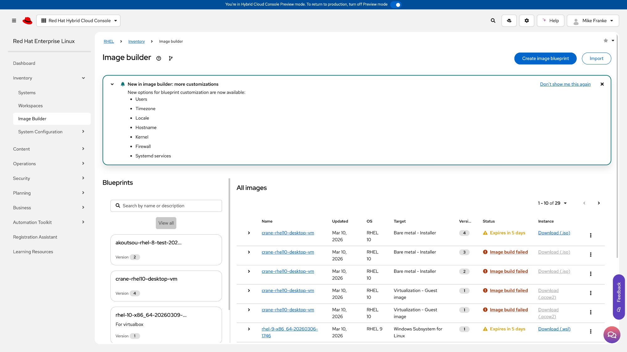
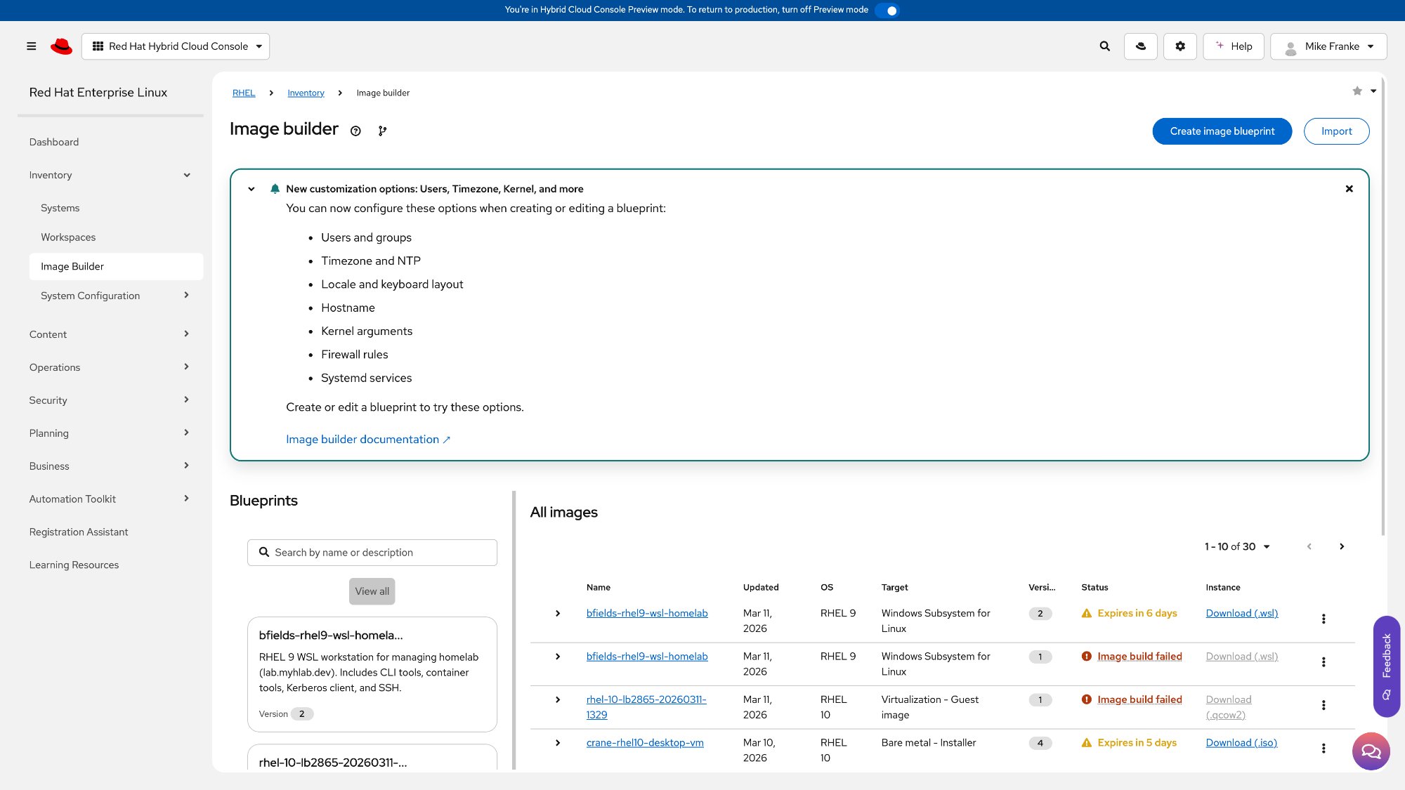
Before and after
The "What's New" banner on Image Builder's landing page had a vague title, confusing dual-dismiss pattern, no call-to-action, and no documentation link. One sentence of design direction produced five concrete improvements.
The challenge
Every design team has the same bottleneck: designers spot interface problems constantly, but fixing them means filing a Jira ticket, attaching a Figma mockup, waiting for a sprint, and hoping a developer interprets the intent correctly. I've never used git, never opened a terminal on purpose, and never written production code.
When my VP challenged the team to be the first to ship a design-driven merge request using Cursor AI, I took it on. The question: what if a designer could go directly from "I see the problem" to "here's the fix," and what if the entire team could do it?
Starting from zero
I didn't have any of the developer tools or access set up on my machine. Connecting to Red Hat's internal code repositories requires multiple layers of security configuration that I'd never done before. I described what I needed to Cursor in plain English, and it handled the entire setup conversationally, solving authentication and security issues along the way. What would have taken me hours of research took minutes.
The moment that sold me: Cursor hit a security certificate error that I wouldn't have known how to diagnose, let alone fix. It identified the problem, applied a one-line fix, and moved on. That's the kind of invisible blocker that would have ended this experiment for most non-developers.
I wanted to work on an actual Red Hat product, not a demo. The first attempt failed: an Edge Management frontend turned out to be stale code from 2021. I deleted it and moved on. The second attempt landed: Image Builder, the RHEL tool for composing and managing system images. Actively maintained, TypeScript and React with PatternFly. Cursor cloned the latest code and pushed it to a personal project on Red Hat's internal GitLab, fully isolated from the upstream team's work.
Spotting the design issues
This is where my UX background took over. Cursor analyzed the component source code, but I directed what to look for based on design principles I've used throughout my career. We identified three genuine issues on the Image Builder landing page.
These aren't nitpicks. They're the kind of issues that surface in usability testing. The AI found the components; I evaluated them through a design lens.
One sentence of design direction
I chose the banner as the primary target: most visible element on the page, and the before/after would be immediately obvious. I told Cursor what I wanted: a specific title that names the features, one dismiss action instead of two, descriptive list items, a clear next step, and a link to documentation.
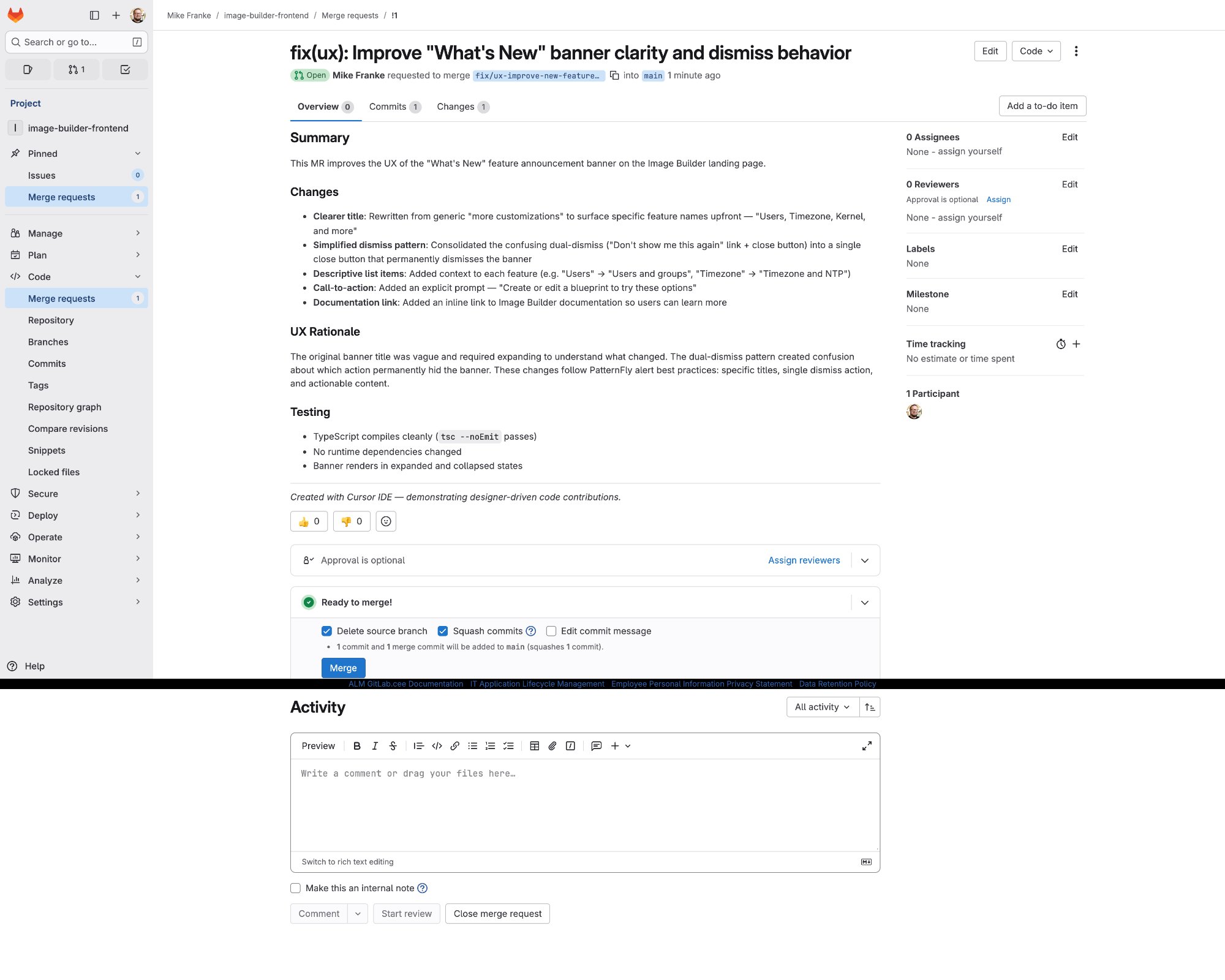
My total input was one sentence of design direction. Cursor implemented all five changes in a single component, verified the code compiled, committed it, pushed it to GitLab, and created the merge request with a structured description including a UX rationale section.
| @@ -1,13 +1,12 @@ import { React, useState } from 'react' | ||
| 1 | 1 | import { |
| 2 | 2 | Alert, |
| 3 | 3 | AlertActionCloseButton, |
| 4 | AlertActionLink, | |
| 4 | Button, | |
| 5 | 5 | Content, |
| 6 | Flex, | |
| 6 | } from '@patternfly/react-core'; | |
| @@ -21,19 +19,37 @@ export default NewAlert = ({ setAlertDismissed }) => { | ||
| 21 | 19 | imageBuilder.newFeatureNewCustomizationsAlertDismissed, |
| 22 | 20 | ); |
| 23 | const [displayAlert, setDisplayAlert] = useState(isAlertDismissed); | |
| 21 | const [displayAlert, setDisplayAlert] = useState(!isAlertDismissed); | |
| 24 | 22 | const useGetDocumentation = useDocumentation(); |
| 26 | const dismissAlert = () => { | |
| 27 | setDisplayAlert(false); | |
| 28 | window.localStorage.setItem('imageBuilder.alertDismissed', true); | |
| 29 | }; | |
| 23 | const dismissAlert = () => { | |
| 24 | setDisplayAlert(false); | |
| 25 | persistDismissed(true); | |
| 26 | }; | |
| @@ -44,27 +46,41 @@ return displayAlert ? ( <Alert …> ) : null | ||
| 44 | title="New customization options: Users, Timezone, Kernel, and more" | |
| 45 | actionClose={<AlertActionCloseButton onClose={() => setShowAlert(false)} />} | |
| 47 | title="New options for blueprint customization" | |
| 48 | actionClose={<AlertActionCloseButton onClose={dismissAlert} />} | |
| @@ -71,5 +75,5 @@ } | ||
| 71 | 75 | </Content> |
| 72 | 76 | </Alert> |
| 73 | 77 | ) : null; |
| 74 | 78 | }; |
Two failures, two lessons
Two things broke along the way, and both turned out to be learning moments.
The local preview crashed. The development proxy uses containers built for Intel chips, and my M1 Mac couldn't run them. Cursor diagnosed the crash and pivoted to an alternative: a browser snippet that applies visual changes to the live production page for screenshots. The workaround took 30 seconds.
GitLab tried to run CI/CD pipelines. The repository included automation config from the original project, and GitLab tried to run it against my personal copy. Impact on the real team: zero. Cursor walked me through disabling CI/CD in the project settings.
Both would have been dead ends without the AI. Not because they're hard problems, but because I wouldn't have known what the error messages meant, let alone where to look for the fix.
What this proved
A new capability for the entire org
This wasn't a one-off experiment. From decision to merge request took under 5 minutes. No code written by hand. No Figma file opened. No developer blocked. That's a proof of concept for a fundamentally new capability: UXD can now close the loop on known interface issues without waiting for a sprint.
The designer never touches a terminal, writes a line of code, or memorizes a git command. This started as a challenge from my VP. It became a documented, repeatable workflow ready for team-wide rollout. Scale this across 8 designers and the backlog of known UI issues that never make it into a sprint starts clearing itself.